Navigating digital terrain: a tailored website for Myers Jackman Spa
A solo UX process — from stakeholder interviews through a live, bookable build in Wix Studio — for a luxury spa launching its first real digital presence.
Freelance project — not currently live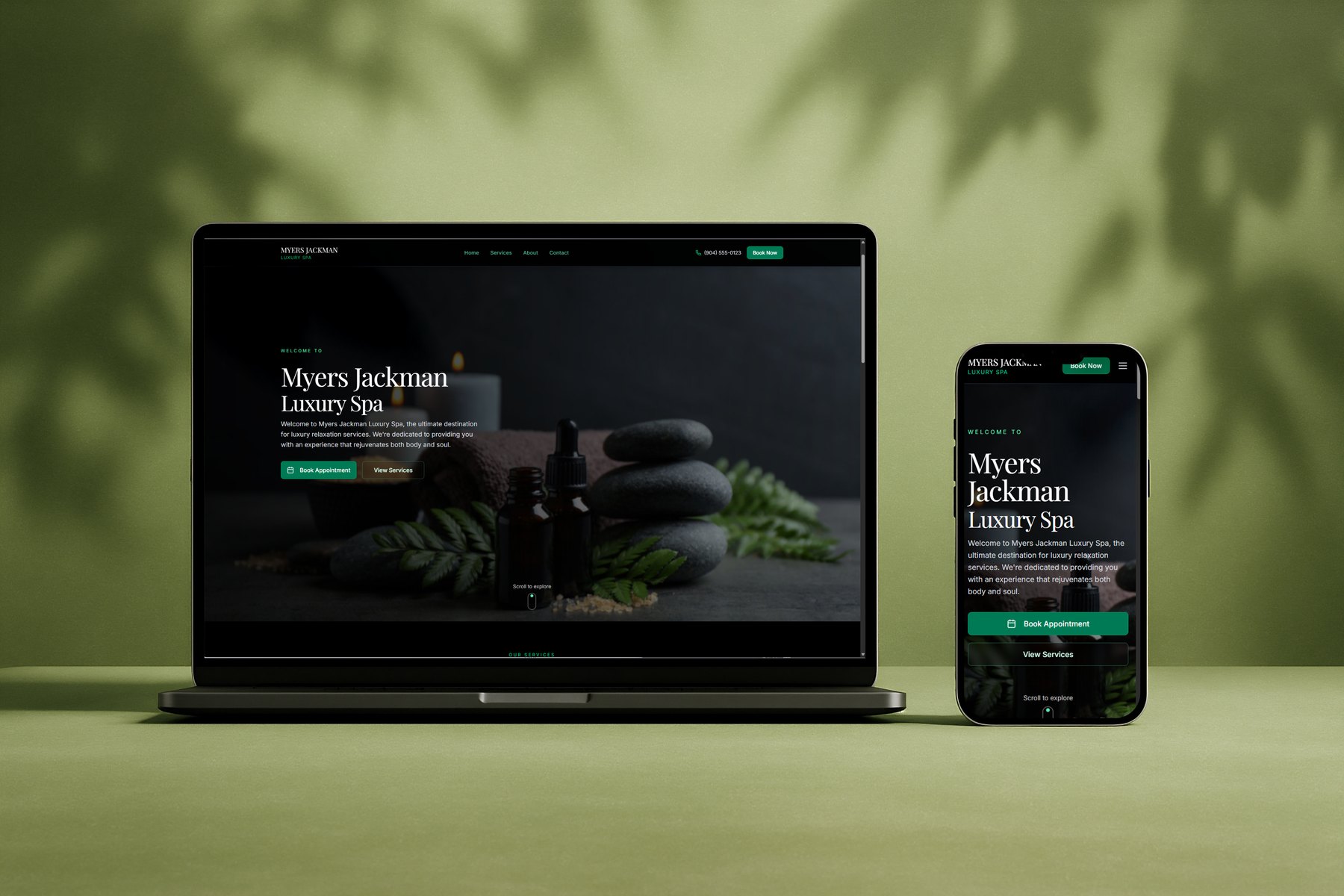
Standing out in a crowded local market
Myers Jackman needed to stand out in a competitive local spa market while launching its very first real digital presence — with no existing site, booking system, or customer data to build from. Getting it wrong carried real business risk: a slow or confusing site would cost bookings directly, and a platform too complex for the owner to maintain herself would leave her dependent on a developer she couldn't keep on call.
- Responsive, mobile-first build — most prospective clients were browsing and booking from their phones
- A clear, low-friction booking flow from service selection through confirmation
- Organized, easy-to-scan service listings, with pricing and duration visible up front
- A polished visual design aligned with the brand, to build trust at first glance
- A platform the owner could edit and maintain herself, with no developer on call
From low-fidelity structure to a polished, bookable site
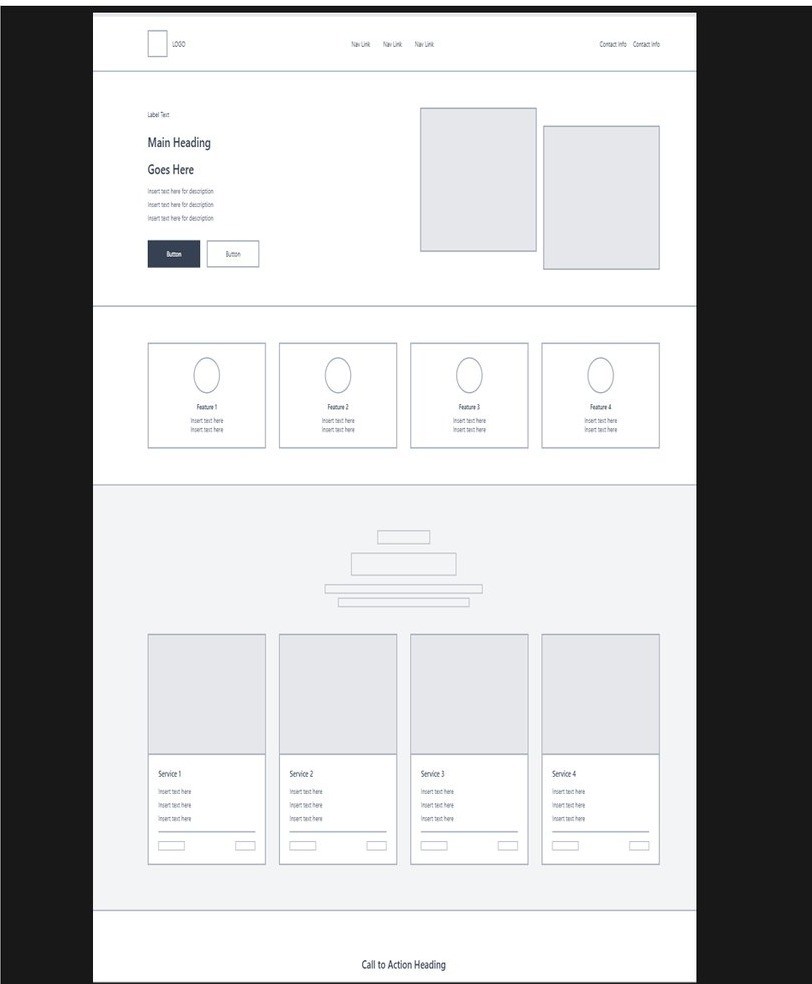
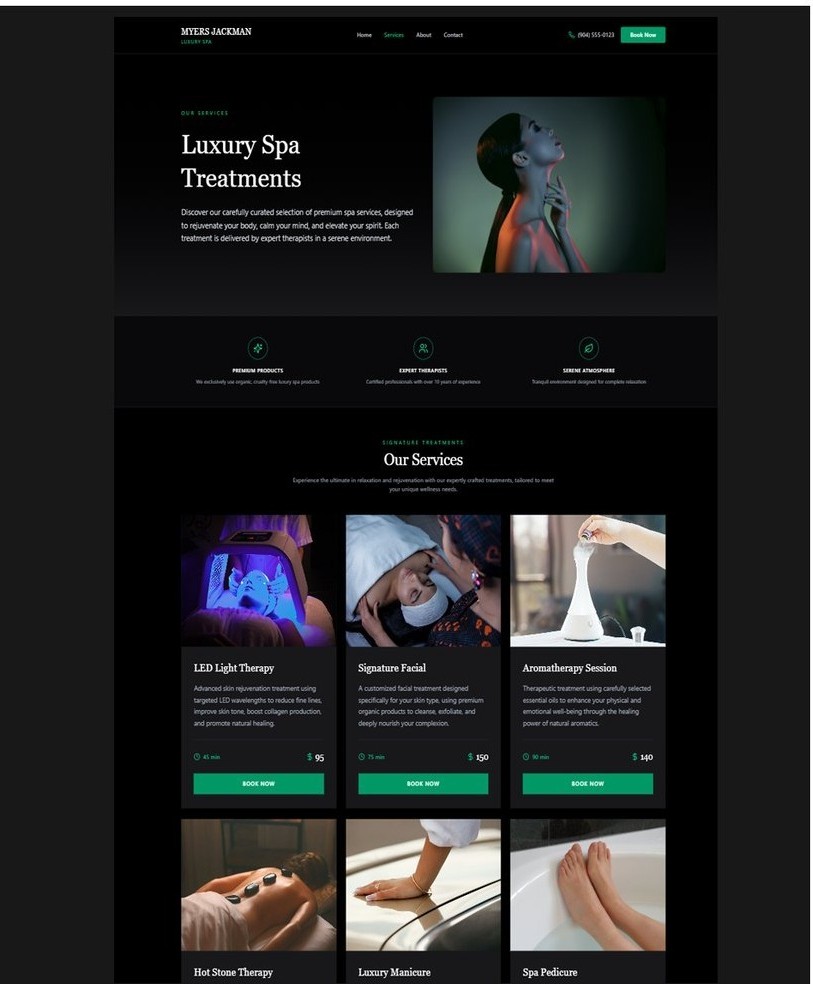
Navigation and layout were simplified around three core flows — browsing services, booking an appointment, and contacting the spa — with the booking action surfaced early and consistently for mobile users. Service cards were designed to combine imagery, pricing, duration, and a "Book Now" CTA in one glance, reducing decision fatigue and booking friction.
 Wireframe
Final build
Wireframe
Final build
Drag to compare — low-fidelity wireframe vs. the final high-fidelity "Our Services" build — pricing, duration, and booking CTAs surfaced on every card.
Outcomes
Early usability testing on the booking flow surfaced one clear, fixable friction point alongside strong quantitative results:
Beyond the numbers, the owner reported a real gain in confidence — both in the site's usability and in her own ability to manage it independently, with a stronger sense of alignment between the finished product and the Myers Jackman brand.
The dark-background contrast finding is already informing the next iteration: increasing text weight and size on the hero and footer, and auditing every dark section against the same accessibility standard applied across this portfolio.
Reflection: UX discipline matters even on small-scale projects. Clear communication with a non-technical stakeholder was as critical as any wireframe, and choosing the right platform turned out to be a UX decision as much as a technical one — working within real-world constraints shaped nearly every choice on this build, and it was a reminder that UX decisions affect a business's daily operations, not just its aesthetics.
Next up: continued usability testing post-launch, expanded analytics on booking behavior, and iterating the booking flow against real data as it comes in.
What customers and the owner actually needed
Research combined a stakeholder interview with the owner, informal interviews with past salon/spa clients on how they search for and book services, and a competitive audit of local nail-salon and spa websites.
Clarity
Confusing service menus were causing booking drop-off before a client ever reached checkout.
Accessibility
Most prospective clients were on mobile and wanted an expedited, low-friction booking path.
Visibility
Clients tied visual clarity directly to how much they trusted a spa's professionalism.
Simplicity
The owner needed to update services, pricing, and copy herself, with no technical background.
Benchmarking against the local competition
The competitive audit evaluated four local nail-salon and spa businesses. Lavish Nail Lounge — one of the four, and the nearest direct competitor — was broken down with a SWOT analysis to see what was already working in the local market, and where a competitor's site was quietly losing bookings.
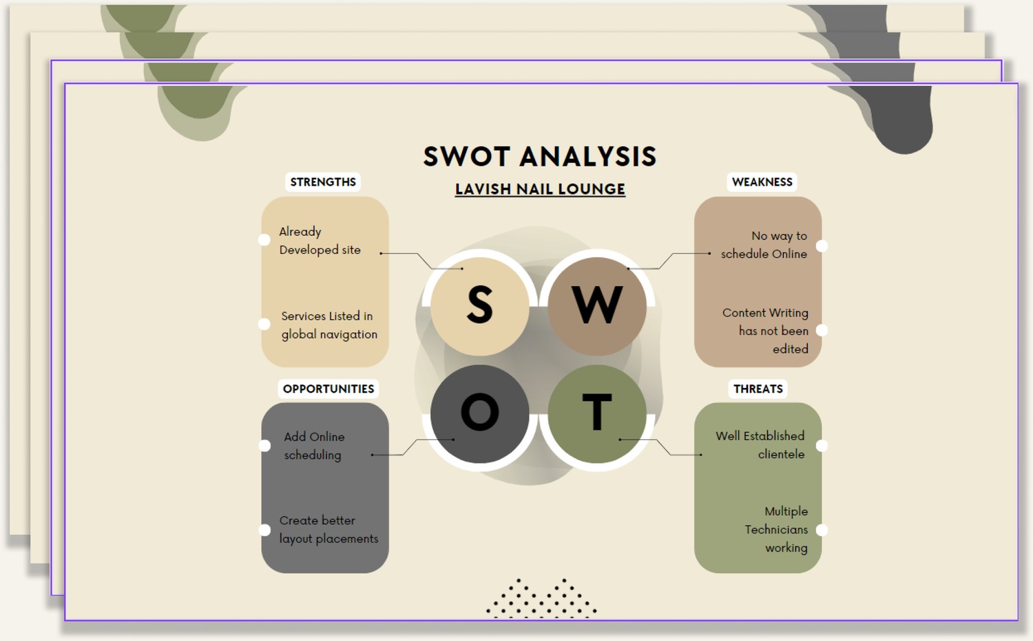
No online scheduling was the single biggest weakness found across all four local competitors audited — closing that exact gap became a core differentiator for Myers Jackman's own booking flow, below.
A booking flow built for drop-off prevention
Booking was the single highest-stakes flow on the site. It was mapped end to end — from homepage through service selection, scheduling, customer info, and a confirmation text — to keep every decision point as short and predictable as possible.
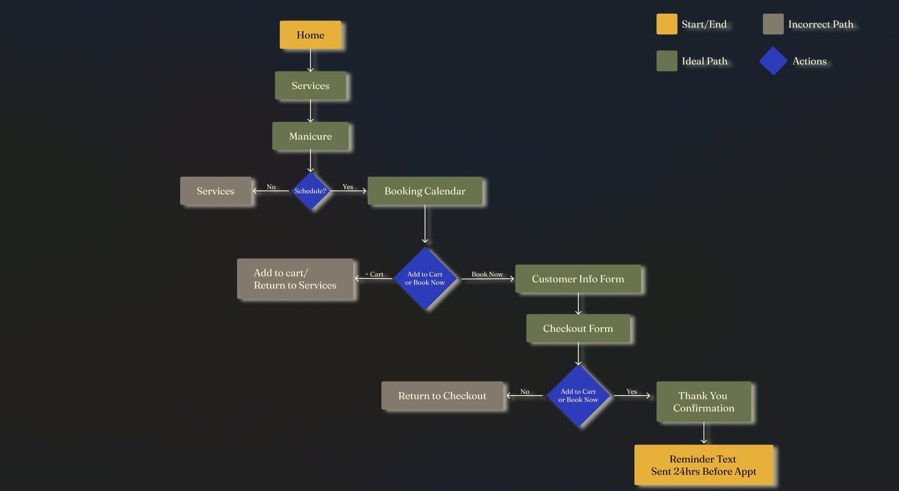
Full booking flow, from first click to confirmation text reminder.
Why Wix Studio
Wix Studio was chosen deliberately, not by default: it offered responsive, mobile-first controls, built-in booking functionality, and a CMS the owner could use to update her own content — reducing her dependency on a developer after launch. It also allowed a smooth Figma-to-build handoff that preserved the design's fidelity. The platform decision was itself a UX decision, made to keep the product sustainable for a small-business owner managing it solo.

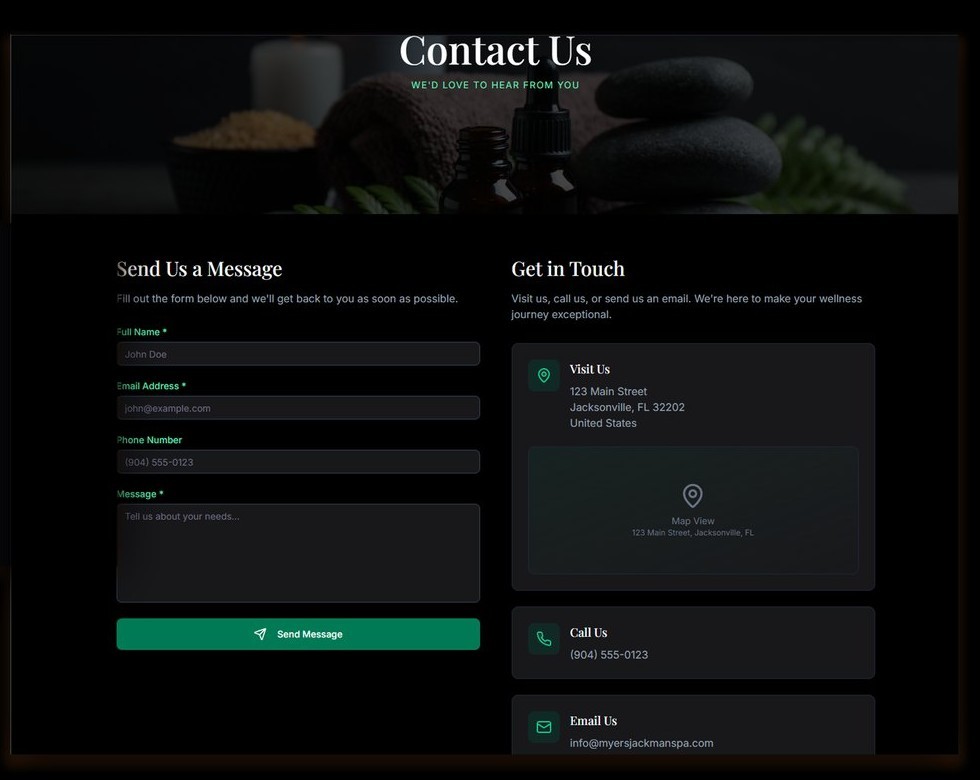
Centralizing contact, minimizing friction
Contact options — form, phone, email, and location — were centralized and kept persistent in the footer, with the contact form itself trimmed to the fewest fields needed to respond.