A medical-services CRM built for both sides of the appointment
Designing a PetSmart medical-service experience that solves pet owners' and veterinary staff's frustrations at the same time, integrated into PetSmart's existing app.
Team project — academic / client engagement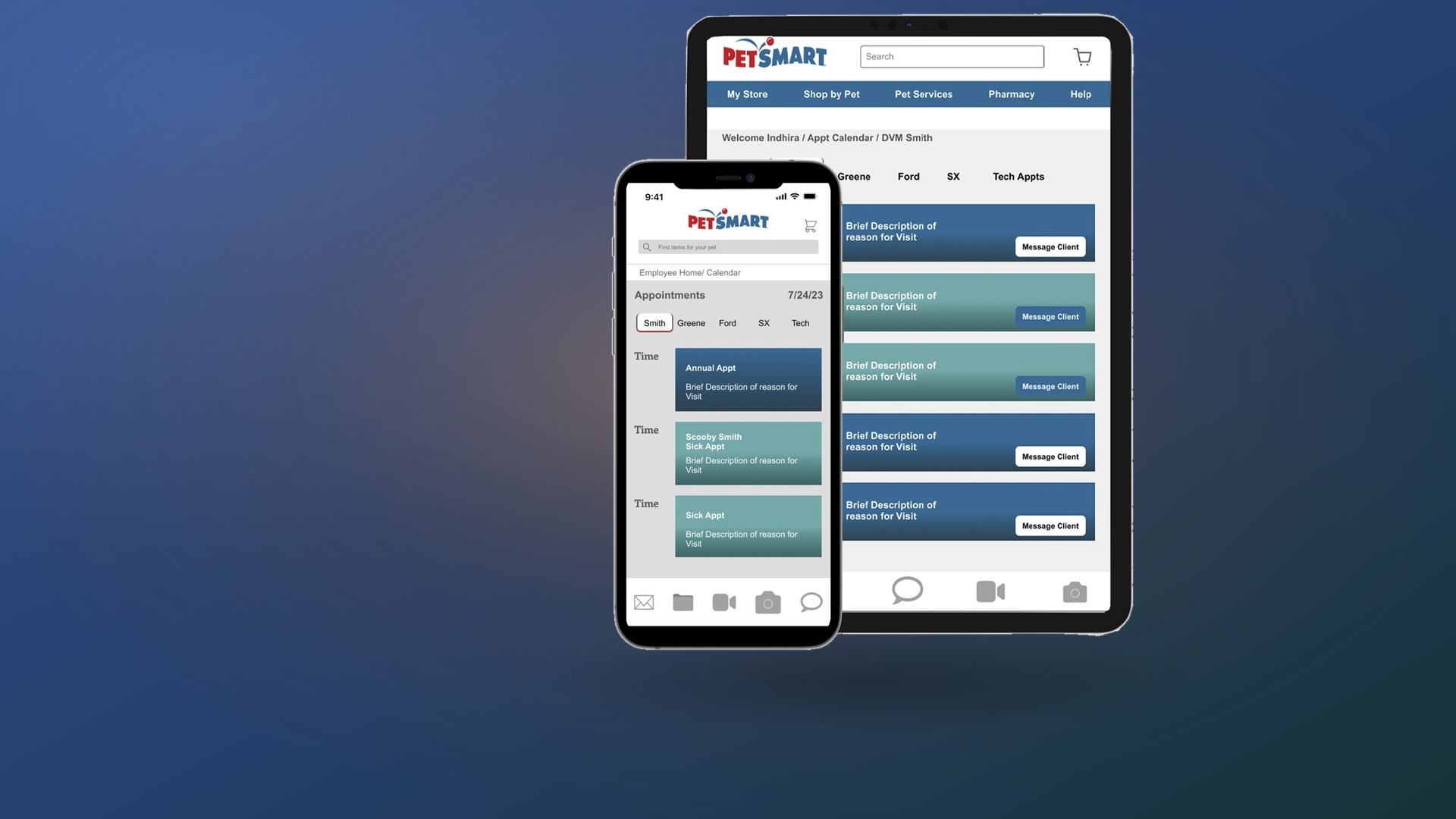
Two very different users, one shared appointment
PetSmart's grooming, boarding, and vet partnerships (including Banfield Hospital) needed a medical-service app that worked for pet owners and vet staff at once. Owners needed emergency access to medical records and clearer appointment categories; staff needed vital patient information before an appointment even started, and a way for clients to submit questions ahead of time instead of remembering them mid-visit.
Pet owners wanted
Clarity — easy online scheduling with clear service expectations. Accessibility — easy record access in any situation, emergencies included.
Vet staff wanted
Preparation — quick access to patient history and behavioral alerts. Clarity — clients submitting questions before the visit, not forgetting until they're in the room, which could add ~20 minutes per appointment.
Four parts, one integrated experience
- Pet ID tags — downloadable medical records and treatment notes for emergencies.
- Communication — messaging, chat, and telehealth without requiring a clinic visit.
- Scheduling — online booking, reminders, and pre-appointment concern submission.
- Integration — built into PetSmart's existing app rather than a separate product.
Reviewing existing veterinary charting software and MyChart (human medical charting) informed the employee-facing interface. A behavioral-alerts system lets staff log cautionary behavior, allergies, and comfort items — for example, flagging a specific treat like peanut butter — directly on a pet's chart.
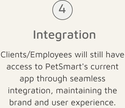
The four-part solution as presented to the client — each part maps directly to a frustration raised in research.
Three iterations in two rounds
Two rounds of testing with 5 veterinary technicians over 3 days produced three concrete design changes.
Alert pop-up on chart entry
Surfaces allergies, cautions, and stress-reduction strategies immediately, enabling faster prep.
Color-coded appointment types
Reused PetSmart's existing site colors for a cohesive, familiar feel.
Direct messaging, no email sign-in
Built owner confidence and reduced staff frustration around account friction.
What the numbers behind the frustration looked like
Research combined 3 interviews with veterinary technicians (5+ years' experience each) on charting, information gathering, sign-in flow, and time management, with teammates' interviews of 6 pet owners on their current app experience and care needs.
Of vet-tech departures: 39% cite compassion burnout, 25% corporate practices, 22% management issues, 7% technology gaps — with average new-hire training costing roughly $10,000 over 3–6 months. 40% of surveyed owners said they would not use PetSmart's vet services at all.
Designing for the owner and the technician at once
Research converged on two people who needed opposite things from the same appointment: a pet owner trying to get a question answered without a clinic visit, and a technician trying to walk into a room already prepared.
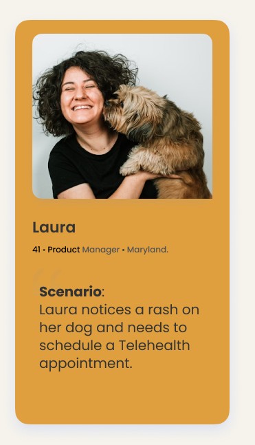
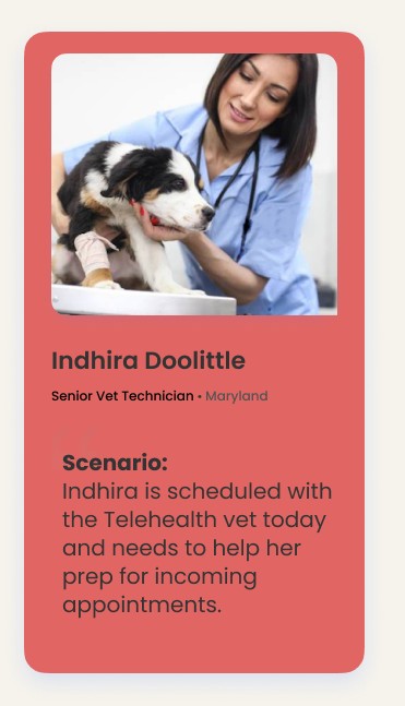
Laura, a pet owner balancing a full-time job against her dog's care, and Indhira Doolittle, the senior vet technician who preps every chart before the vet walks in.
Where PetSmart already led, and where it didn't
Benchmarking PetSmart against Petco, PetDoctors, and VCA showed real-time appointment booking and in-app communication were already competitive — but access to pet charts and records was inconsistent across the category, and no competitor offered all five capabilities at once.
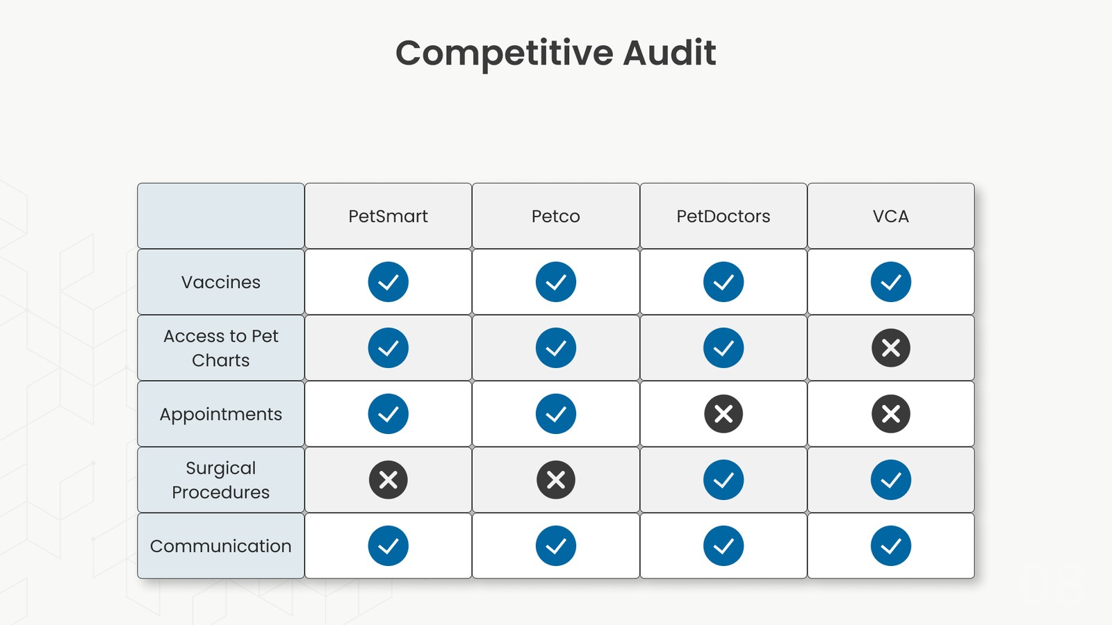
Competitive audit: PetSmart and Petco were the only two offering appointments, chart access, and communication together — surgical procedures were the clear gap.
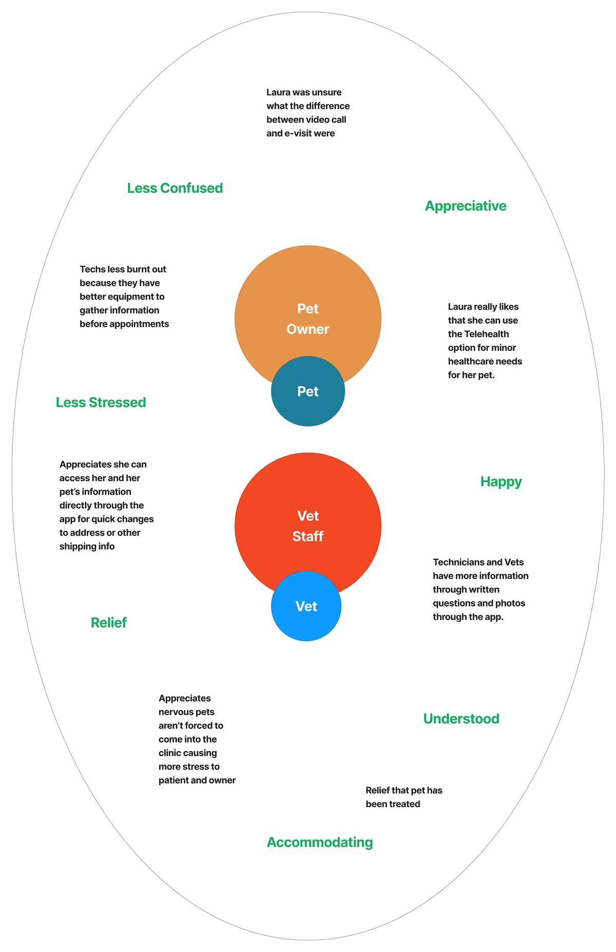
Mapping how both pet owners and vet staff would feel at each step clarified that the real win wasn't fewer visits — it was less stress on both sides of them.
From "my dog has a rash" to a confirmed appointment
A retrospective journey map (Laura's current, frustrating path through PetSmart's existing tools) was charted against a prospective one (her path through the new design) — the comparison is what surfaced the two usability findings that later showed up in testing: confusion between "video call" and "e-visit," and calendar text too small to read comfortably on mobile.
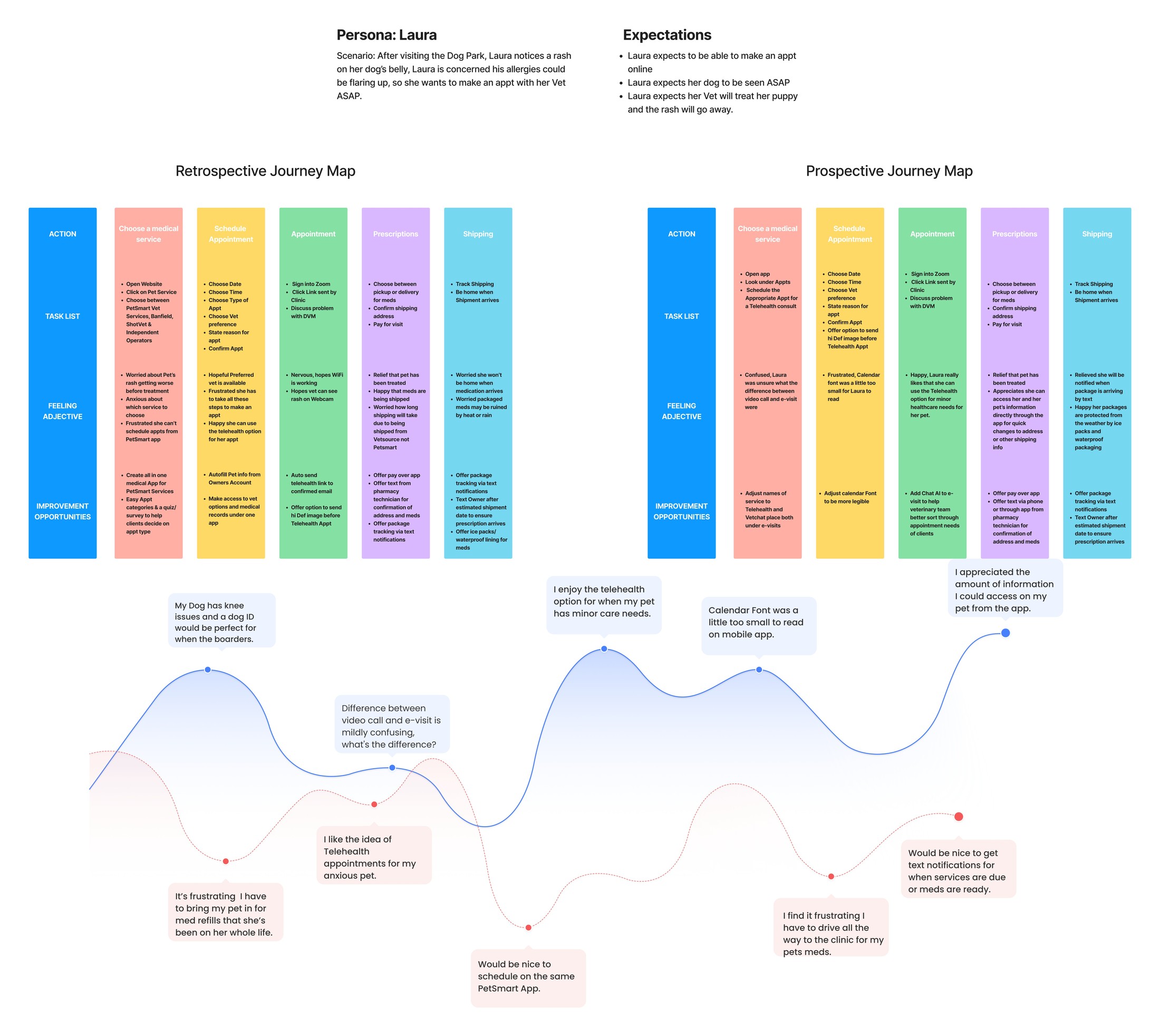
Retrospective journey (left) next to the prospective, redesigned journey (right) — five stages each, from choosing a service through shipped prescriptions.
Giving technicians the full picture before they walk in
The behavioral-alerts system in practice: a caution pop-up fires the moment a flagged pet's chart opens, the alert itself records exactly what helped last time, and staff can add a new one in seconds from the exam room.
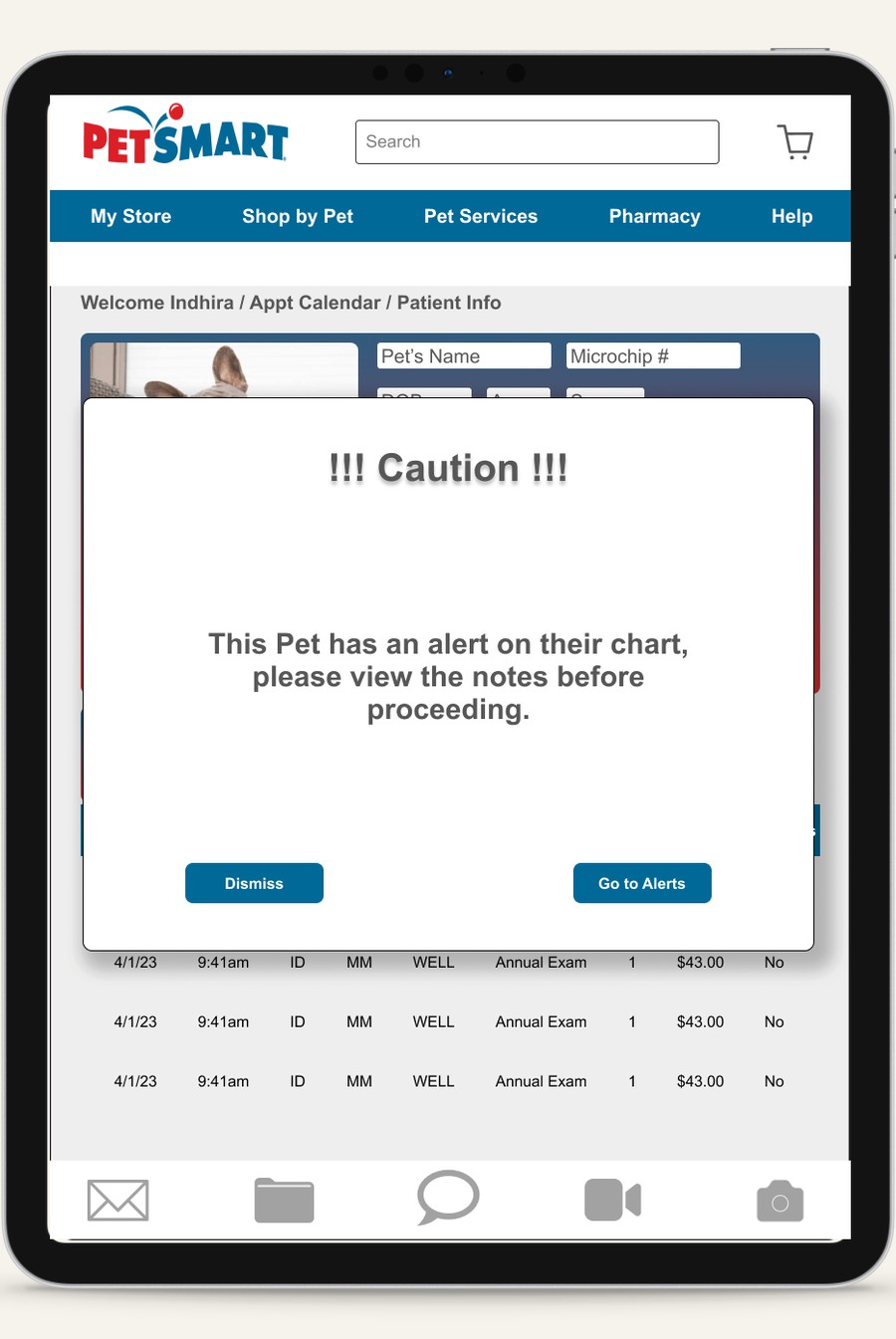
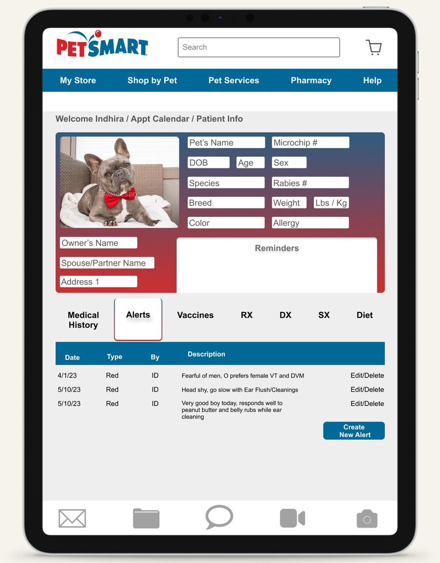
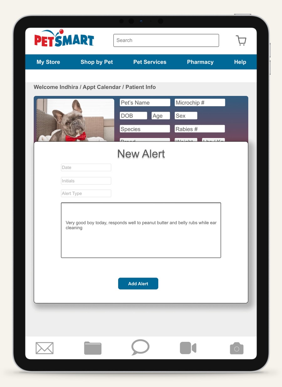
Caution pop-up → the pet's full alert history → logging a new one — the exact peanut-butter note from the behavioral-alerts write-up, as it appears on the real chart.
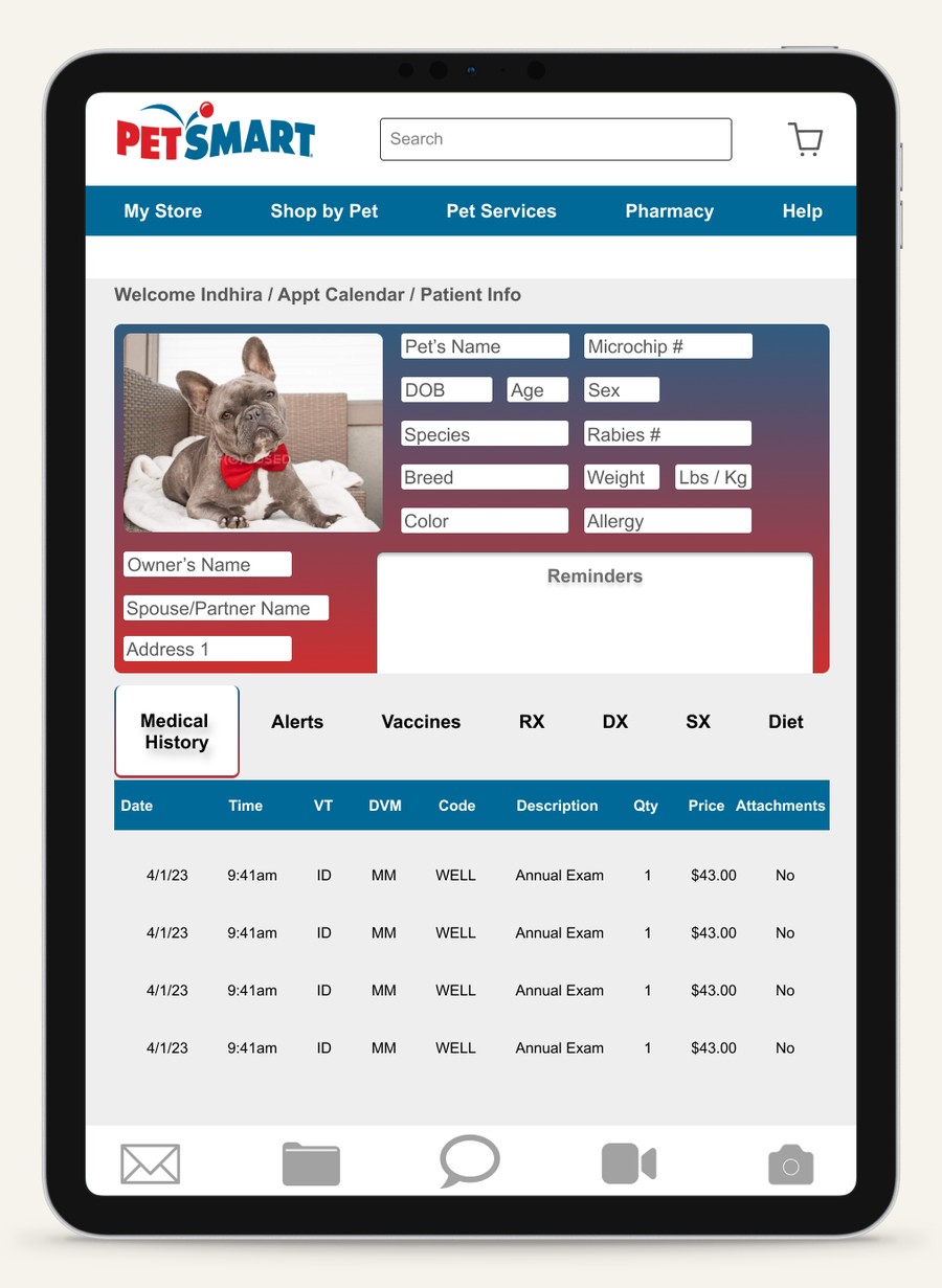
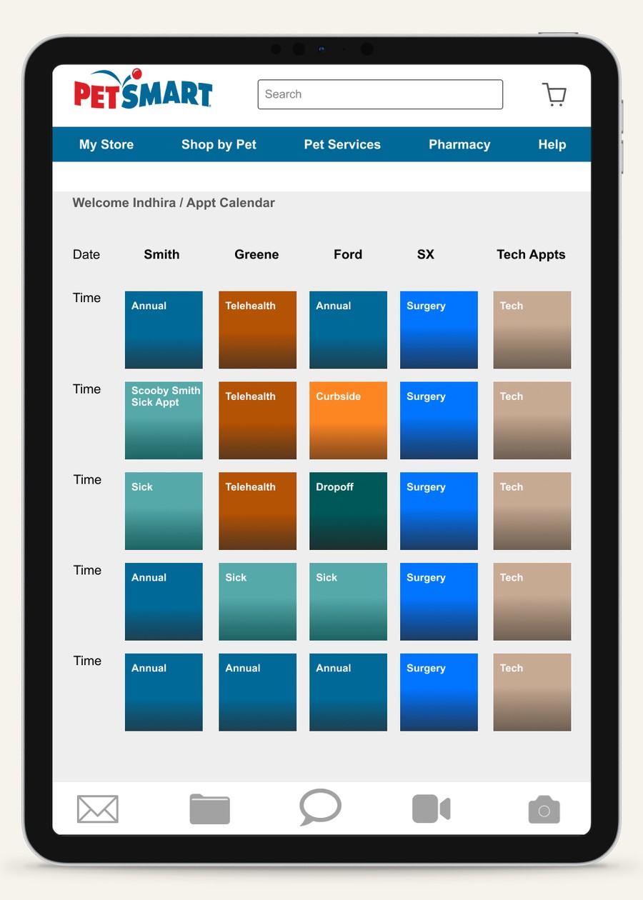
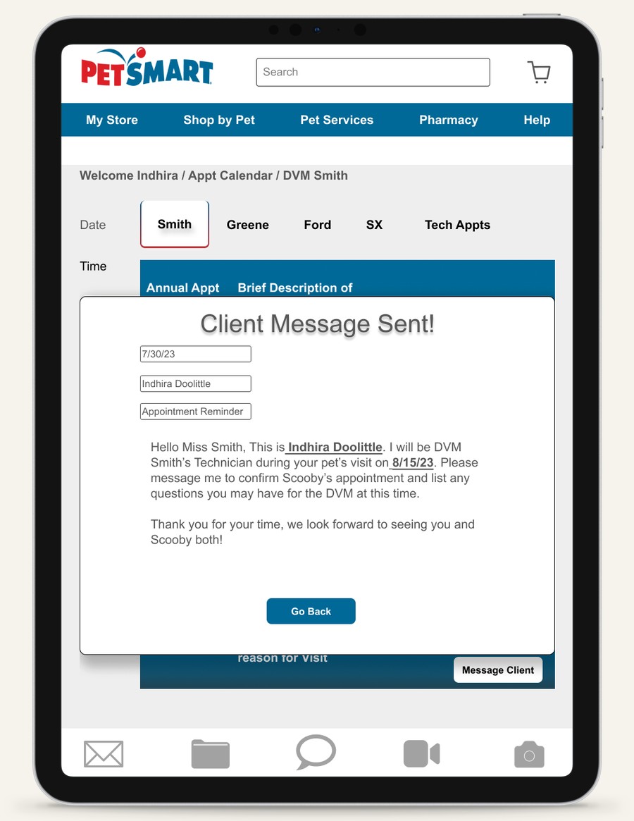
Medical history, the color-coded appointment calendar, and direct messaging to the client — the three design changes that came directly out of usability testing.
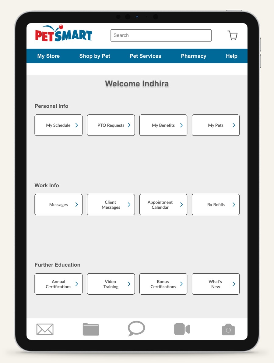
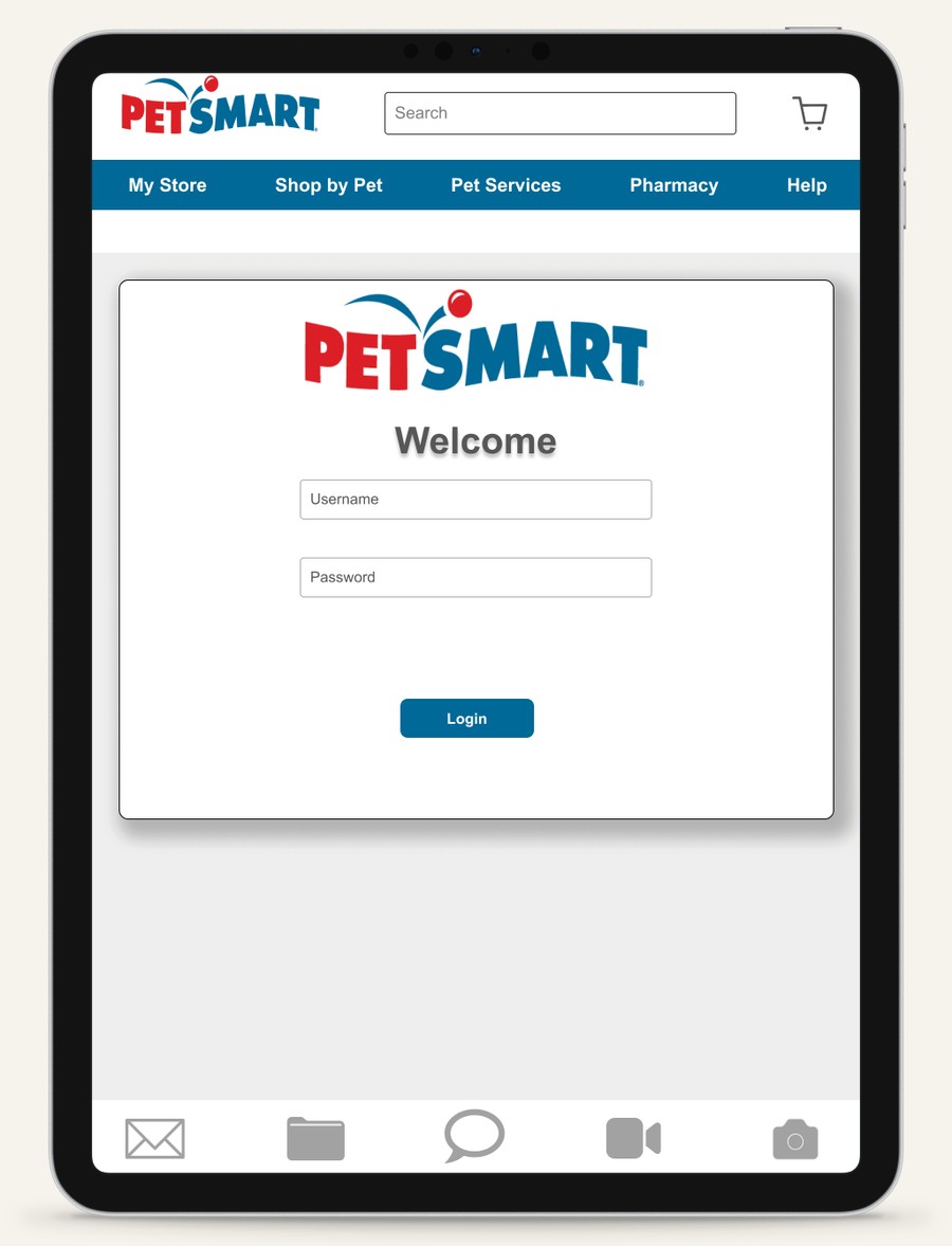
The technician's home dashboard and sign-in screen — kept inside PetSmart's existing employee app rather than a separate login.
Reusing PetSmart's own palette to code appointment types
The earliest calendar wireframe was plain, numbered patient slots — useful for layout, useless for a technician scanning a full day at a glance. The fix was to color-code by appointment type using colors already in PetSmart's brand palette, so the system felt native rather than bolted on.
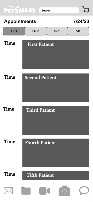
Early low-fidelity pass — structure first, color later.
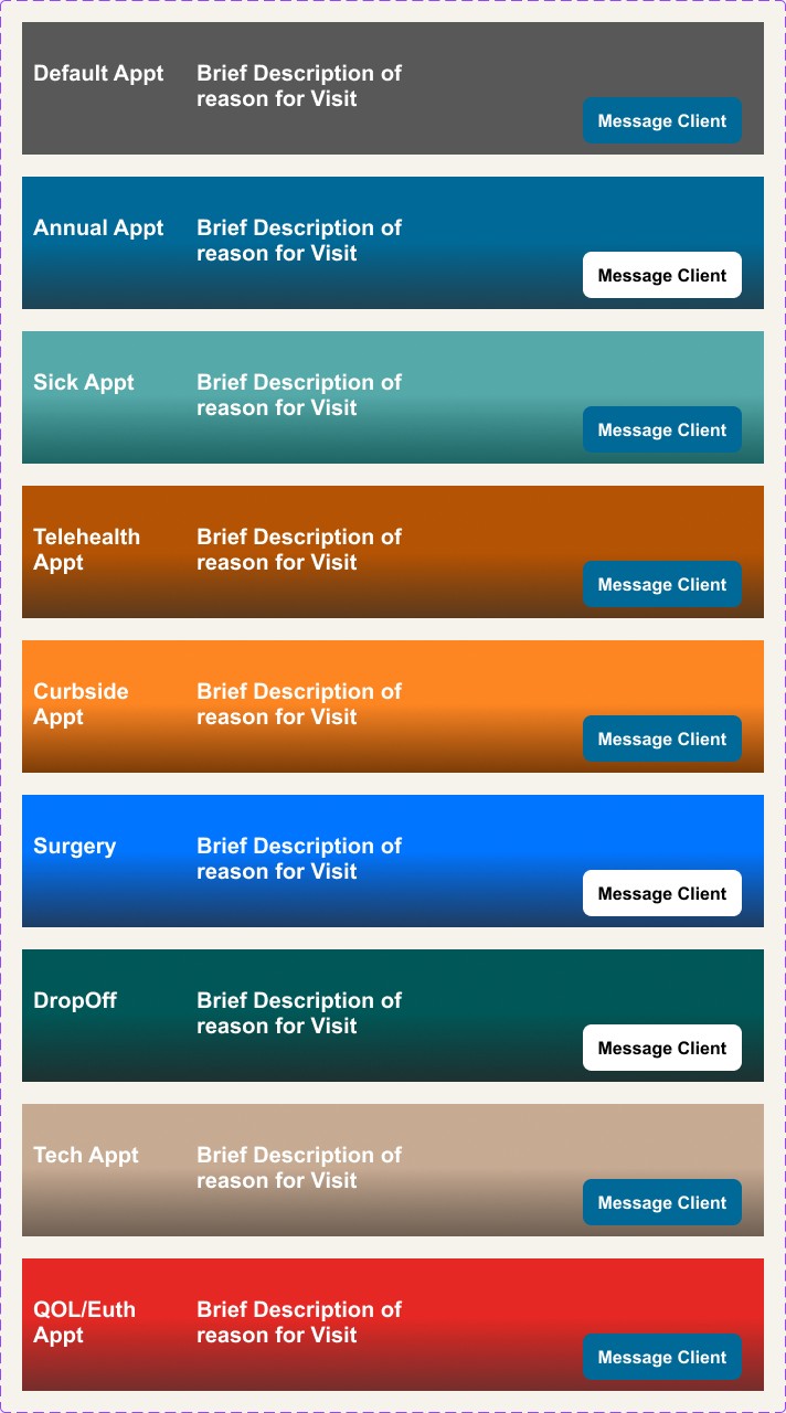
The final nine-category color key — QOL/Euthanasia appointments deliberately set apart in red so staff never mistake the day's hardest visit for a routine one.

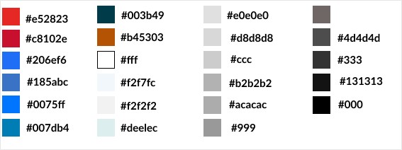
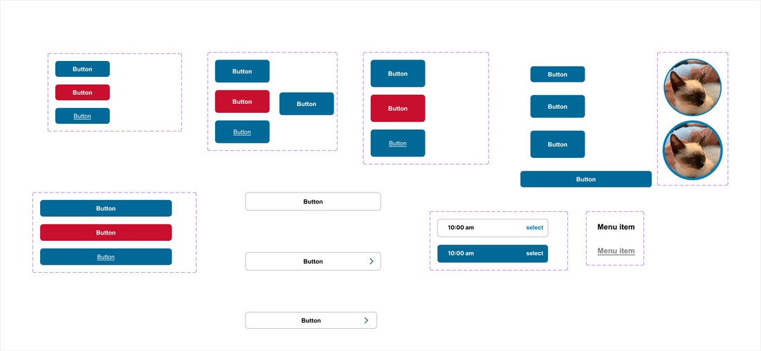
Every new screen was built from PetSmart's existing brand system — same reds and blues, same button logic — so the CRM felt native rather than bolted on.
Scheduling and pet ID tags, from the owner's side
On Laura's side of the same system: a Services screen built around the four most-requested visit types, and a Pet ID screen holding downloadable records for every pet on the account.
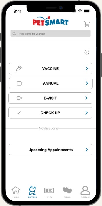
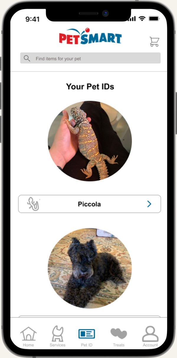
Scheduling (left) and Pet ID tags (right) — the two solution pieces owners interact with most.
Walking through a real visit, panel by panel
Before any screen was built, the team storyboarded a single shared scenario — Scooby's ear infection — from both Indhira's and Laura's point of view, to confirm the behavioral-alerts idea would actually change how an appointment felt, not just how it looked on a chart.
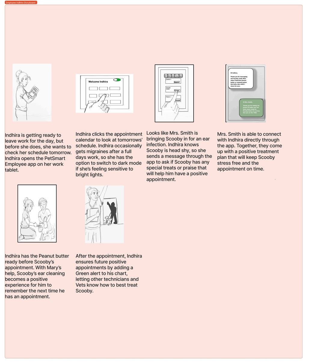
Indhira's side: a Scooby appointment turned positive by one logged preference.
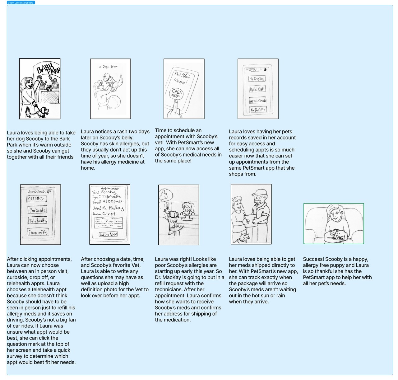
Laura's side of the same visit: rash noticed, telehealth booked, meds shipped.
What conversational interviews surfaced
Conversational interviews drew out technicians' real frustrations far better than structured ones did — and a willingness to scrap designs that weren't serving the user, backed by daily stand-ups and upfront planning, kept the team aligned under a tight two-week timeline.
Retention potential
Burnout, management issues, and tech gaps account for roughly 71% of vet-tech departures — this system's prep tools and alerts speak directly to that.
Telehealth & AI triage
Telehealth partnerships against compassion fatigue, and AI-assisted triage of owner questions to free up staff time, are natural next steps.